Glossary of Printing Techniques
To see a video on the process of lithography, go to YOUTUBE
Lithographic process
The process of lithography involves several steps: First, the drawing is executed onto a lithographic stone. Then, one to three copies are printed on silky white paper or on ivory paper. These prints are called “avant la lettre” (“before the letter”, before text, or artist’s proof). These were the ones most sought after by Daumier’s friends and collectors. If the proof was satisfactory, the “lettre” was added: the caption, the title, the number of the print etc.
Printing, paper qualities
A series was then printed on thick white paper. These proofs were called “sur blanc” and were sold either individually or bound together as an album for collectors and subscribers. Passeron, in his 1968 exhibition in Blois, France, estimates that approximately 50 prints on sur blanc (wove paper) were carefully printed separately to appear apart from the newsprint as special editions or single collectors’ copies. The sur blanc is usually of a far better quality than newsprint. On very rare occasion, the printer used China paper. These extremely delicate prints were beautifully executed in very small numbers. Nearly all of them were mounted on wove paper to give the thin China paper a better support. All of these prints are considered very rare.
Newspaper print
After these preliminary prints, the stone was used to print the 2-3’000 copies for the newspaper edition. For more exact information on the quantities sold, please consult the newsprint section of this website, where information about the CHARIVARI is covered.
Test proofs, Copyright, Censor
Once the censorship system was introduced, the “avant la lettre” print was replaced by two or three copies on fine paper (“papier mince”), the so-called “test proofs”. One of them was sent to the copyright office, another one to the censor (once the text had been added), and the third one remained with the printer. The censor usually approved or disapproved of the text within the same day (by writing “oui” or “non” on the proof) , after which the printer gave his approval in handwriting and filed it (for later reference in case he had to prove that it had passed the censor). Each approved lithograph was then registered individually in log-books, with a registration number, date of deposition, title and, if available, name of publisher and artist. Only then the printing process could begin. (Pierre Cabanne, Vilo 1999).
We are showing various proofs, avant la lettre prints, and prints with handwritten captions by Daumier or the texter in the DAUMIER REGISTER ©, the digital Daumier work catalogue on the Internet:
• Prints avant la lettre with handwritten caption, for example: DR1285
• Prints with approval by the censor, for example: DR3634
• Prints signed and dated by the printer, for example: DR3613
In general it may be assumed that the majority of Daumier’s prints were executed as follows:
Proofs before the text (“avant la lettre”) on white paper
Prints on China paper on selected topics only (most of them mounted to a heavier paper because of their frailty): “Chine appliqué”
Prints on fine paper, often with printer’s remarks (“papier mince avec certificat de tirage”)
Prints on wove paper (“sur blanc”) in black and white with the complete text. These prints appeared on single sheets or in a bound album.
Prints on wove paper (“sur blanc”) colored. In most cases hand colored using egg-white and gum Arabic. These prints appeared on single sheets or in a bound album.
Newsprint such as “Charivari” with text au verso, in black and white, but also colored.
Topics and captions
According to research by Adhémar, the topics to be treated in the day’s print were usually suggested to Daumier by an editorial board which met in the morning to discuss the political situation of the day. They agreed on the theme to be illustrated by the artists. We know that in the case of Daumier, Vernier and Gavarni this procedure was more or less strictly adhered to, while Cham on the other hand was responsible himself for the artistic ideas as well as for the captions of the lithographs he supplied to the paper. Unlike Cham, who wrote his own texts, Daumier almost never supplied the caption himself. This work was usually done by the writers in Aubert’s printing shop. We have indication about one of these journalists, Albert Wolf, who received 5 francs for each text, however we also found lower salaries paid to other writers. Other important text writers were the journalists Biais, Cler and Jaime. In the DAUMIER REGISTER © we show photographs of various proofs, avant la lettre prints, and prints with handwritten captions by Daumier or the caption writer.
It sometimes happened that several artists supplied similar lithographs on the same political theme. The editor in chief would then decide which print was to be published. The ones not used were set aside for publication at a later date. This explains why some early numbers on lithographic stones appeared months later, sometimes in a different context.
Lithographic stones
The stones were delivered to the artist on a weekly basis. The artist then made his drawings onto the stone and numbered the stones (most of them) for reference purposes. Unfortunately, the numbering of the stones was sometimes inconsistent. It does however allow us in most cases to understand around which date a drawing was made, independently of its actual publication date, and to what series it might initially have belonged to. Once the stones were used, the drawing was erased and the stone could be used again.
Text editing
Once the a stone was selected for publication, a few trials proofs (sur blanc) were made and forwarded to the text editors (like Jaime, Biais, Albert Cler etc). These journalist would sometimes write the text on the front or back page or add a handwritten note on a piece of paper, which would be attached to the print. Sometimes the artists were able to do their own correction of the prints and a correspondence emanated between editor and artist, showing crossed out first proposals, counterproposals and correction.
Once the text was agreed upon, two or three trial proof copies with text were printed (sur blanc), and at least two were sent to the censor for approval.(except before 1835 and between 1848 and 1852). The printer would sign a copy stating that the print is conform. The censor’s office was staffed with civil servants, who in case of doubt had get approval by their head of department at the ministry of the interior. Some of these rare prints can be seen in the DAUMIER REGISTER ©, the digital Daumier work catalogue on the Internet. If the censor did not agree with the caption, the print was sent back and the editor was allowed to change the text and re-submit the print. If the print was rejected, it was (irregularly) filed by the censor in a register. However most of these prints have been destroyed.
Legal depot
Once a print was accepted, a copy of it was entered in the “depot legal” and each approved lithograph was registered with a number, deposition date, title, name of the publisher and artist. During the period of the Second Empire, when censorship did not exist, the prints were immediately printed on newspaper sheets, which already held the Government’s tax stamp.


Above two images courtesy of GreatCaricatures.com
Charivari
The format of the Charivari usually consisted of four pages: The front page showed a political essay by one of the paper’s editors. The second page covered local topics. The third page was always reserved for the caricature, and once the format was increased, the text from the first page was continued on the lower third of the third page. The last page was either fully or partially used for advertisement.
The initial subscription price for the Charivari amounted to 72 francs per year for subscribers in the Paris area, while ten years later the price had dropped to 60 francs. It took many years until the paper was finally available in grocers shops, in the beginning one could only subscribe to it or read it in public reading rooms. The readers came mainly from the middle class bourgeoisie.
Censorship
We can estimate that about half a percent to one percent of Daumier prints have been censored. One must also remember that after the text had been rejected by the censor, the printer had the right, to change it in such a way that no infringement would take place. The print would thus appear with an “adjusted” text, acceptable to the regime.
The entire period of censorship can be divided into various sections:
After 1830 pressure was increased resulting in a peak around 1835.
Between 1835 and 1848: Freedom of the press was extremely repressed (press laws of September 9, 1835).
In 1848 complete freedom and revocation of the September laws.
From end of 1848 until 1851: again a period of relatively contained pressure on the press. From 1852 to 1868 extreme censorship (Presidential decree against the press).
From 1868 to 1870 a period of more liberal censorship laws and in 1871 complete freedom during the time of the Commune.
After that again tight control during the Third Republic.
It is often assumed that the stamps (timbre Royal) visible on prints by Daumier are censorship approval stamps. It should be remembered however that the censorship question of a print had already been cleared before it’s publication. The censor had previously seen and rejected or approved the print. In both cases the prints were registered at the depot legal for future reference.
Stamp tax
Papers containing political lithographs or engravings were subject to a stamp tax. This implied that the paper had to be printed on stamped, government approved paper ONLY. (art 6-13). Some of these stamps periodically even showed the value of the stamp. One can understand this also as some kind of censorship, since the government would tax each edition, thus knowing the exact numbers of issues distributed by the publishing house. Apart from this tax the editor had to supply a high bond BEFORE he was allowed to start publishing. The bond served as a guarantee and was confiscated by the Government in case of infringements and non compliance.
Over the period of changing forms of Government the “Timbre Royal” was renamed “Timbre National” and later abolished when a new tax on advertisement appeared.
Daumier’s colleagues
These artists worked during Daumier’s time at Aubert publishing company:
J.A. Baric | E. de Beaumont | Bertall (A d’Arnoux) | Cham ( Amédée de Noé) | A.H.Darjou | Gustave Doré | Draner (J.Renard) | Gavarni (S.H.G. Chevalier) | Gill ( A.G. de Guines) | Grandville ( J.I.I.Gérare | A.Grévin | White (P.Hadol) | A.Lepetit | H.B.Monnier | Leeroy (V.A.Morland) | J.Pelcoq | E.J.Pigal | D.A.Raffet | Radonensberg (J.Radon) | Stop (P.G.B.L. Morel-Retz) | C.J.Traviès | C. Vernier

Print by HADOL (Charivari of January 2, 1867): Daumier and his colleagues at the Charivari. The title of the caricature is “Carte de Visite du Charivari”. Daumier is in the first row, second from left.
The draft is drawn directly to the polished, or grained, flat surface of a lithographic stone, (in the beginning on Bavarian limestone) with a greasy crayon or sharp feather and ink. It is then chemically fixed with a weak solution of acid and gum Arabic. In printing, the stone is flooded with water, which is absorbed everywhere except where repelled by the greasy ink. Oil-based printer’s ink is then rolled on the stone, which in turn is repelled by the water soaked areas and accepted only by the drawing. A piece of paper is laid on the stone and it is run through the press with light pressure. The final print shows neither a raised nor embossed quality but lies entirely on the surface of the paper. The design may be divided among several stones, properly registered, to produce through multiple printings a lithograph in more than one color.
A transfer lithograph (French: “autographie”) uses the same technique, but the design is drawn on specially prepared transfer paper with a lithographic crayon and is later mechanically transferred to the stone.
A zincography is the same as a lithograph, but using a zinc plate instead of a stone.
Here is an example of a lithographic stone:

This stone is part of a private collection in Switzerland. The previous owner was Z. Bruck. The stone is registered by L. Delteil under Nr 3247. It was used for print in “Le Boulevard” in 1862, and for the special edition of “Souvenirs d’Artistes”, a large size sheet with sur blanc prints. The size of this lithographic stone is 27,7 x 33 cm x 3,5 cm.
For more information on “Lithography” watch this interesting short video on Printmaking Processes or go to WIKIPEDIA
See here an old photograph of chromolithographic printing machines.

 FIRMIN GILLOT (Brou 1820-Paris 1872) received his patent for “zincography” on March 21,1850. To honor the significance of this inventor, the former rue de la Grotte in Paris was named after Firmin Gillot in 1951 by Pierre de Gaulle.
The common name used for this process was “Gillotage” or “Paniconography”. This new system made it possible to engrave any type of drawing, text included, on a zinc plate by use of a fatty ink. An acid was then added to the parts not covered by ink. The resulting zinc relief could be used almost infinitely.
This procedure practically represents the basis of modern photogravure, which started to be successful around the same time. Obviously, the production costs were reduced considerably with this new process. About 270 prints by Daumier were produced in this method. They appeared mainly in the Journal Amusant ( 1864-66) and in the Charivari ( 1870-1872).
It is quite important to make a distinction between the “original” lithographs, drawn from the soft stone, and the “gillotage” produced by Gillot, Marchandeau, Yves et Barret, and Lefman. Some of the prints have been signed by their printers accordingly:
Daumier never drew on a zinc plate, but on a lithographic stone. From the stone, a lithographic proof was produced. Usually a handwritten text was added on a separate piece of paper for the printer.
Once the text was approved, the cliché for the zincography was composed. Finally the zincography or gillotage was produced.
The difference in quality between a lithograph and a gillotage can be quite amazing: DR 3925 by Daumier is here shown as a lithographic proof sample

and in the following picture as a gillotage.

In most zincographies the printers placed their marks onto the print (see picture). However where this is missing, it can sometimes be difficult to distinguish between lithograph or zincography. When looking at our example given above, the distinction becomes apparent: a lithography will always be more clear and direct, while a gillotage loses the half tones and details supplied by the stone lithography.
With the development of photolito, the perception changed entirely and a new chapter in printing took its course……
Another example here below of the wood engraving DR6021.
 ORIGINAL WOODBLOCK
 METAL PLATE FOR GILLOTAGE
 GILLOTAGE PRINT AS APPEARED IN “MONDE ILLUSTRÉ”
Daumier disliked wood-engraving. As practiced during his lifetime, it was frankly and simply a reproductive process: the artist drew on a wood block: skilled technicians, by cutting away with exquisite care a thin layer of wood around and between the penciled lines, put the drawing into relief, so that it could be printed.

Woodblock (left) and print right)
The concept of an artist using wood-engraving as a creative medium, and cutting the block with his own hands, did not come into general practice until years later. Theodore de Banville tells in his Souvenirs (Paris, 1883) of this hatred of Daumier’s for wood-engraving: “He said that he was tired and bored with drawing on wood, and wanted to have nothing more to do with it, that the lithographic crayon alone followed his thoughts, while the lead pencil was stubborn and wouldn’t obey him; that finally he had come to look with horror upon this kind of drawing, where nine times out of ten one is betrayed and dishonored by the engraver.”

Drawing on woodblock (left) and print (right)
Yet some of Daumier’s finest drawings were made on wood. They now exist in no other form than impressions taken from the engraved block, so that we are forced to consider the vignettes as originals, once removed from Daumier. We regret, with Daumier, the inefficiency of wood-engraving as a reproductive process. But it was the only way by which drawings could be printed together with type until photo-engraving was perfected at the end of the century.
The vastly superior process of lithography required a different kind of press than that used for type, and thus books illustrated with lithographs were much more expensive to produce than those which contained wood-engravings. Towards the end of his life Daumier became much interested in a crude form of photo-engraving, Gillotype, and seemed to revel in the camera’s precision, for the illustrations so reproduced are among the most freely drawn of his mature style.
Were Daumier working today, undoubtedly his drawings would be reproduced by the perfected photomechanical process used for reproducing newspaper caricatures, and they would be appreciated as drawings, not as photo-engravings. In the same way the illustrations which he made for books were appreciated in their day as drawings, and not as wood-engravings. That is how Baudelaire looked at them. In his “Curiosites esthétiques” (Paris, Calmann-Levy, 1928) he wrote: “Daumier scattered his talent in a thousand directions. Commissioned to illustrate a rather poor medico-poetic publication, the “Némésis médicale” [by François Fabre, Paris 1840], he made some superb drawings”.
In all, Daumier did about a thousand illustrations on wood; most of them appeared, usually with the work of other artists, in little pocketsize essays with titles containing the words “Physiology” or “Physiognomy,” and which to judge from their number, must have been very popular in the 1840s.
They were serio-comical studies, documentary in a sense, of Parisian types, customs and manners; among the subjects treated we find Parisian cafes, school boys, rich men, lawyers, doctors, musicians, poets, tailors, money-lenders, old maids, hunters and lovers. The most ambitious illustrated book of the period, “Les Français peints par eux-memes”, is virtually but a col-lection of similar booklets, published in 422 installments, and forming eight volumes, which were brought to nine by the supplementary “Le Prisme”. It is attractive to see in this type of illustrated book, with its emphasis on people and their activities, the forerunner of the picture magazine, which has taken so important a place in modern journalism; and it will not be overlooked that in 1843 the magazine “L’Illustration” was founded.
Yet interesting as these publications are to the social historian, the majority have but slight literary or artistic value, and would be forgotten were it not for the fact that some of them were illustrated by Gavarni, Daumier, Grandville (that almost forgotten artist, admired – so the rumor goes -by Walt Disney) and a host of lesser names. (Beaumont Newhall Source: Parnassus, Vol. 10, No. 5, Oct., 1938, pp. 12-13; 32).
To see a video on the process of wood engravings go to YouTube.
It is surprising that so few of the many who have recorded the works of Daumier have given much space to his woodcuts, all being concerned for the most part with his paintings or with the lithographs which appeared in the two Paris dailies, La Caricature and Le Charivari, by which he earned his daily bread. Yet in the medium of the woodcut Daumier was surely at his best. Dropping for the moment the political ferment of the day with its attending choleric attack upon some high dignitary of the law or, at Philipon’s request, upon Louis-Philippe himself, Daumier took his material from life about him in the Paris streets and suburbs. Intimate and friendly, for all the touch of malice behind them, the little vignettes decorating the pages of Les Français peints par eux-mêmes, Museum Parisien, La Grande Ville, Némésis Medicale, and Le Prisme (1840-1842) have a spontaneity and freedom that must necessarily have been lost in the daily grinding out of the famed lithographs. Their greatness lies in something more than such attributions of quality as good drawing, technique, brilliancy, and other phrases of print description. Finding drama in the most casual goings and comings of the people about him, Daumier, drawing his social caricatures with an uncompromising hand, shows an amazing, almost psychic penetration into the very soul of the many layers of society of the time. Caustic, satirical, with startling directness he seems so easily to catch the spirit of each of his types. The complacent, wealthy bourgeois, stuffy city official, and unctuous bill-collector are just that-nothing more. He depicts the struggles of the lower classes for existence and with each other with an unsurpassed eloquence.
Daumier has put his finger upon all the bathos and pathos in ordinary living.
Ineffably amusing is the cut from Le Monde Illustré of the family walking through the Egyptian galleries of a museum and, as all three gaze up at a wall-relief depicting a row of animal-headed deities the wife exclaiming, “No, the Egyptians were not beautiful.”
Through a series of incidents created by Daumier and afterwards used to illustrate Paul de Kock’s La Grande Ville, one can follow the daily life of the bourgeois Parisian from his rising in the morning, his toilet, his way to business or morning promenade, the pause at noon in the garden of the Palais Royal to set his watch by the report from the little cannon, through his afternoon amusements in the Champs Elysées and Bois de Boulogne, to the evening at the theatre and his retiring. In sharp contrast to this smug, well-fed middle class, there are in the same volume the lodging-house inmates at four sous the night. The drawing of the shabby little man sitting on his mattress, back against the wall and smoking his clay pipe, his hat and slippers on the floor beside him while all around him sleep the other “guests,” is nothing short of masterly! Riimann in his catalogue sentimentally speaks of these illustrations as the “Sunshine and Rain in Life.” In the Némésis Medicale, Daumier helps the author, François Fabre, to take a fling at the whole medical profession from the worthy M. D.’s and sages-femmes to the charlatans on their soapboxes. He depicts crowds swarming into the gates of an Orthopedic Institute, the gruesome ravages of a cholera-morbus epidemic, and the strutting father having the strangely shaped head of his infant prodigy examined by a phrenologist. Will he tell the fond parent that it is not an indication of genius as he has supposed but probably criminal tendencies? And so Daumier goes on through his astounding medley of types.
Sympathetically, almost tenderly it seems at times, he produces with amazingly simple treatment his powerful studies of physiognomies. With what whimsicality he has drawn the two street musicians in Le Monde Illustré or the poet writing in bed in his attic or the groups of art-lovers in the galleries and auction rooms.
Although of the last century, Daumier cannot be held to his period. Not only did he exert a powerful influence upon his contemporaries and immediate followers, for example, Millet and Delacroix, but he continues to be a fertile source of inspiration. He is too great to be anything but eternal and universal. The illustrations of these little books have as much appeal as though they were done by one of our present-day cartoonists.
Take the drawing for Le Bourgeois Campagnard by Frédéric Soulie-the little man in carpet slippers, rake in hand, looking over his spectacles, could easily be one of the droves of commuters in New Jersey or Westchester measuring the sprouts in his own garden against those in his neighbors’. If one replaces the topper by a felt or straw hat in another illustration, one has a man of the twentieth century sitting with his wife on the ridge of a hill gazing out upon rolling fields and turning over in his mind-even as you and I-whether or not life in the country would be as peaceful as this one afternoon of an excursion from town.
Historically these little vignettes are of an importance that is out of all proportion to their size, as can be seen by any one who has looked into the origins of the contemporary revival of the woodcut in France. The modern movement owes its impulse to Lepère, probably, more than to any other one or many men, and as has been pointed out, he found much of the inspiration for his technical innovations in the woodcuts, which Daumier designed in the late thirties of the last century.
It is even believed by a few who are acquainted with the material that nothing done on the wood since the days of Dürer and Holbein is of greater merit, or possessed of stronger lasting qualities. That such an opinion should be possible only goes again to show that the nineteenth century still remains the least known of all centuries in the world of prints.
(The Woodcuts of Daumier. Author: Margaret H. Daniels. Source: The Metropolitan Museum of Art Bulletin, Vol. 21, No. 1 (Jan., 1926), pp. 16-19. Published by: The Metropolitan Museum of Art, New York)
The Museum of Modern Art in New York gives an excellent introduction to printing techniques.Click here to see the short slide show. (opens in a new window)
Three Major Print-Making Processes
Intaglio – The process of incising a design beneath the surface of hard metal or stone. Plates are inked only in the etched depressions on the plates and then the plate surface is wiped clean. The ink is then transferred onto the paper through an etching press. The printing is done with a plate bearing an image in intaglio and includes all metal-plate etching and engraving processes. The reverse of this process is known as relief printing.
Planographic – The process to print impressions from a smooth surface rather than from creating incised or relief areas on the plate. The term was devised to describe lithography.
Relief – All printing processes in which the non-printing areas of the block or plate are carved, engraved, or etched away. Inks are applied onto the protected surface and transferred onto the paper. The reverse process is known as intaglio printing.
Common Print-Making Technologies
Aquatint – Printing technique capable of producing unlimited tonal gradations to re-create the broad flat tints of ink wash or watercolor drawings by etching microscopic crackles and pits into the image on a master plate, typically made of copper or zinc. The majority of Spanish artist Goya’s (1746-1828) graphic works were done using this technique.
Blind – Printing using an un-inked plate to produce the subtle embossed texture of a white-on-white image, highlighted by the shadow of the relief image on the un-inked paper. This technique is used in many Japanese prints.
Collagraph – Printing technique in which proofs are pulled from a block on which the artwork or design is built up like a collage, creating a relief.
Drypoint – Printing technique of intaglio, engraving in which a hard, steel needle incises lines on a metal plate, creating a burr that yields a characteristically soft and velvety line in the final print.
Engraving – Printing technique in which an intaglio image is produced by cutting a metal plate or box directly with a sharp engraving tool. The incised lines are inked and printed with heavy pressure.
Etching – Printing technique in which a metal plate is first covered with an acid-resistant material, then worked with an etching needle to create an intaglio image. The exposed met-al is eaten away in an acid bath, creating depressed lines that are later inked for printing. This technique was thought re-, have been developed by Daniel Hopfer (1493-1536). Etching surpassed engraving as the most popular graphic art during the active years of Rembrandt and Hercules Segher in the 17th century, and it remains one of the most versatile and subtle printing techniques today.
Iris or Giclée – A computerized reproduction technique in which the image and topology are generated from a digital file and printed by a special ink let printer, using ink, acrylic or oil paints. Giclée printing offers one of the highest degree of accuracy and richness of color available in any reproduction techniques.
Linocut is printed from linoleum, usually backed with wood for reinforcement. The printed surface has less texture than in a woodcut because of the supple nature of linoleum. The material takes all types of lines, but is most suited to large designs with contrasting tints.
Lithography – Printing technique using a planographic process in which prints are pulled on a special press from a flat stone or metal surface that has been chemically sensitized so that- ink sticks only to the design areas, and is repelled by the non-image areas. Lithography was invented in 1798 in Solnhofen, Germany by Alois Senefelder. The early history of lithography is dominated by great French artists such as Daumier and Delacroix, and later by Degas, Toulouse-Lautrec, Picasso, Braque and Miró.
Mezzotint – (mezzo= half ; tinta= tone), a reverse engraving process used on a copper or steel plate to produce illustrations in relief with effects of light and shadow. The surface of a master plate is roughened with a tool called a rocker so that if inked, it will print solid black. The areas to be white or gray in the print are rubbed down so as nor to take ink. It was widely used in the 18th and 19th centuries to reproduce portraits and other paintings, but became obsolete with the introduction of photo-engraving.
Monotype – One-of-a-kind print made by painting on a sheet of metal or glass and transferring the still-wet painting to a sheet of paper by hand or with an etching press. If enough paint remains on the master plate, additional prints can be made, however, the reprint will have substantial variations from the original Image. Monotype printing is not a multiple-replica process since each print is unique.
Offset Lithography – A special photo-mechanical technique in which the image to be printed is transferred to the negative plates and printed onto papers. Offset lithography is very well adapted to color printing.
Serigraphy (Silkscreen) – A printing technique that makes use of a squeegee to force ink directly on to a piece of paper or canvas through a stencil creating an image on a screen of silk or other fine fabric with an impermeable substance. Serigraphy differs from most other printing in that its color areas are paint films rather than printing-ink stains.
Woodcut – Printing technique in which the printing surface has been carved from a block of wood. The traditional wood block is seasoned hardwood such as apple, beech, or sycamore. A modern trend, however, is to use more inexpensive and easily attainable soft woods such as pine. Woodcut is one of the oldest forms of printing. It was first used by the Chinese in the 12th century and later in Europe toward the end of the 14th century.
In the picture you can see a wood block, belonging to a private collection in Switzerland. It is a drawing by Daumier entitled “Au buffet de l’Exposition des Beaux-Arts: Amour de l’Art et de la Côtelette” of June 20, 1868, for « Le Monde Illustré ».

Wood Engraving is made from the end-grain surface of blocks. This surface has no grain and can afford great precision and detail.
Common Art Print Terms
Acid-free Paper or Canvas – Paper or canvas treated to neutralize its natural acidity in order to protect fine are: and photographic prints from discoloration and deterioration.
Canvas Transfer – Art reproduction on canvas which is created by a process such as serigraphy, photomechanical, or giclee printing. Some processes can even recreate the texture, brush strokes, and aged appearance of the original work of art.
Color-variant Suite – A set of identical prints in different color schemes.
Impression – Fine art made by any printing or stamping process.
Limited Edition – Set of identical prints numbered in succession and signed by the artist. The total number of prints is fixed or “limited” by the artist who supervises the printing him(her)self. All additional prints have been destroyed.
Monoprint – One-of-a-kind print conceived by the artist and printed by or under the artist’s supervision.
Montage (Collage) – An artwork comprising of portions of various existing images such as from photographs or prints, and arranged so that they join, overlap, or blend to create a new image.
Multiple Originals – A set of identical fine prints in which the artist personally conceived the image, created the master plates, and executed or supervised the entire printing process. Example: etching.
Multiple Reproductions – A set of identical fine prints reproducing the image of an original artwork created by a non-printing process. Example: serigraph of an oil on canvas.
Open Edition – A series of prints or objects in an art edition that has an unlimited number of copies. Original print – One-of-a-kind print in which the artist personally conceived the image, created the master plates, and executed the entire printing process.
Provenance – Record of ownership for a work of art, ideally from the time it- left the artist’s studio to its present location, thus creating an unbroken ownership history.
Remarque – Small sketch in the margin of an art print or additional enhancements by the artist on some or all of the final prints within an edition.
Restrike – Additional prints made from a master plate, block, lithographic stone, etc. after the original edition has been exhausted.
Print Types
Proofs are prints authorized by the artist in addition to the limited signed and numbered edition. The total size of an art edition consists of the signed and numbered prints plus all outstanding proofs. If a set of proofs consists of more than one print, numbers are inscribed to indicate the number of the prints within the total number of the particular type of proof, (e,g., AP 5/20 means the fifth print in a set of 20 identical. prints authorized as artist’s proofs). Proofs are generally signed by the artist as validation of the prints.
Artist’s proof – Print intended for the artist’s personal use. It is a common practice to reserve approximately ten percent of an edition as artist’s proofs, although this figure can be higher. The artist’s proof is sometimes referred to by its French name, épreuve d’artiste (abbreviated E.A.). Artist’s proofs can be distinguished by the abbreviation AP or E.A., commonly on the lower left corner of the work.
Cancellation proof – Final print made once an edition series has been finished to show that the plate has been marred/mutilated by the artist, and will never be used again to make more prints of the edition.
Hors Commerce Proof – Print identical to the edition print intended to be used as samples to show to dealers and galleries. Hors Commerce (abbreviated H.C.) proofs may or may not be signed by the artist.
Printer’s proof – Print retained by the printer as a reference. Artists often sign these prints as a gesture of appreciation.
Trial proof – Pre-cursor to a limited edition series, these initial prints are pulled so that the artist may examine, refine, and perfect the prints to the desired final state. Trial proofs are generally not signed.
Common Abbreviations used in Art
2nd ed – Second edition: prints of the same image as the original edition but altered in some way (as in change of color, paper, or printing process).
2nd st. – Second state. prints of proofs which contain significant changes from the original print.
AP – Artist’s proof.
Del – (Latin, deleavit) He (she) drew it. Generally inscribed next to the artist’s signature.
E.A. – (French, épreuve d’artiste) An artist’s proof.
Exe or Imp – (Latin, excudit) He (she) executed it. The meaning is synonymous with (Latin, impressit) he(she) printed it.
H.C. – (French, hors commerce) Prints from an edition intended to be used as samples to show to dealers and galleries.
Inc. or Sculp – (Latin, incidit) He(she) cut it. The meaning is synonymous with (Latin, impressit) he(she) carved it. These abbreviations refer to the individuals who engraved the master plate.
Inv, or Invent – (Latin, invenit) He(she) designed it. Generally inscribed next to the artist’s signature.
Lith. or Lithe – “Lithographed By”. Usually follows the name of the printer of the lithograph.
Pinx. – (Latin, pinxit) He(she) painted it. Generally inscribed next to the artist’s signature.
PP – Printer’s proof .
TP – Trial proof.
Photographic Terms
Albumen – The most popular photographic print f~rom 1855 to 1890. Albumen positive prints are made on paper coated with frothy egg white and salt solution and sensitized with silver nitrate solution. The print is then finalized by exposure to sunlight through a negative.
Carbon Print – The first permanent photographic printing process used between 1866 to 1890. Made in three different tones: black, purple-brown, sepia. It is made by using 3 layers of stable pigment in registration on top of each other and requires a minimum of 12 hours to create a single print. Carbon prints are highly sought after and rare.
Cibachrome – A positive print process known for its sharpness, rich color saturation, and permanence. Unless interpositives are made, these prints are made from slides and transparencies, never from color negatives.
Daguerreotype – The first practical photo process invented in 1838 in which an image was formed on a copper plate coated with highly polished silver. Following exposure, the image is developed in mercury vapor, resulting in a unique image on metal that cannot be used as a negative for replication.
Dye Transfer – A high-quality color photographic printing technique involving the transfer of dyes from three separately prepared images onto a single sheet of paper in exact registration. Though costly, this process produces prints with sharp registration, rich color saturation and great longevity.
Evercolor Pigment Transfer – developed by Evercolor using four layers of separate color transfer, cyan, magenta, yellow, and black, in registration to create prints. This very costly process creates very realistic and sharp images which attain three dimensional quality when displayed. Prints done in this process are highly sought after and rare.
Fujicolor Print – Developed by Fuji Film of Japan, Fujicolor prints have the best color gamut and extreme longevity. It was developed originally for 1 hour processing. When used with the light jet printer, this process achieves amazing color saturation, contrast control and extreme sharpness.
Photogravure (Gravure) – Started around 1879, a print process using copper plates. The plate is sometimes chrome plated to insure sharpness and continuous tones throughout the edition. This is a very complex and exacting photo process which produces great longevity.
Photomontage – A composite image made by joining together portions (or all) of more than one photograph to synthesize a unique image.
Plate – Usually a glass or metal sheer coated with light-sensitive emulsion that: is intended to receive the image through the aperture of the lens of a camera when inserted into the camera.
Platinum Print (Platinotype) – A print formed by exposing a negative in contact with payer that has been sensitised with iron salts and a platinum compound. This process is highly prized for its unique cones, high color saturation, exceptional details and beautiful papers. It is a highly permanent and costly process.
Silver Gelatine – A high-quality, black-and-white photographic printing technique in which a natural protein is used as a transparent medium to hold light-sensitive silver halide crystals in suspension, binding them to the printing paper or film, yet allowing for penetration of processing solutions. Made famous by photographers like Weston and Adams, these prints require incredible skill to achieve the rich black and white contrasts while maintaining the subtle grey tones and amazing details throughout the image. Popular from 1920s to present.
Other Terms
Holograph – Holograph comes from the Greek words “holo”, meaning whole and “graph”, meaning message. The combination means “the whole message” which is exactly what the holograph gives the viewer. A Holograph is a “reflective holograph” requiring only an ordinary uncoated light bulb on one side of the film plate to become a magical window displaying three dimensional visions of objects. These objects shift position and perspective exactly as they would if they were really there, where they only appear to be.
(Glossary of fine art terminology: With kind permission of HERNDON FINE ART, Albuquerque, New Mexico)
For more information on “printing technology” go to WIKIPEDIA
Glossaire par Monique Moulène
La technique lithographique
Estampe
Image multipliable obtenue par tirage à partir d’un support gravé ou dessiné, tel qu’une planche de bois, une plaque de métal, ou une pierre lithographique. Cette matrice, encrée et passée sous une presse, s’imprime sur une feuille de papier ou sur un autre support. Le terme s’applique à toutes les techniques : bois, taille-douce, lithographie.
Lithographie
Procédé inventé entre 1796 et 1798 par l’allemand Aloys Senefelder (1771-1834). Après la gravure en relief ou en creux, la lithographie est une technique d’impression à plat (ou planographique). Elle est fondée sur la répulsion naturelle de l’eau face à un corps gras. Sur une pierre calcaire polie et plus ou moins grainée, on dessine à la plume ou au crayon. Le gras de l’encre ou du crayon est fixé sur le support grâce à un apprêt chimique de sa surface à l’aide d’une solution acidulée et de gomme arabique. Sous la presse à imprimer l’encre grasse d’imprimerie est acceptée face à la trace grasse du dessin et rejetée partout ailleurs où la pierre est seulement mouillée.À la place de la pierre, le support peut être une plaque de zinc. Le résultat obtenu est alors une zincographie.
Gillotage ou panicographie
Procédé de photogravure créé en 1850 par Firmin Gillot (1820-1872). À partir d’un dessin au trait réalisé sur une pierre lithographique, dont le cliché est reporté sur une plaque de zinc mordue à l’acide et encrée à plusieurs reprises, il permet d’obtenir une matrice utilisable en typographie, en même temps que le texte. À ses débuts, ce procédé, d’un usage délicat, est seulement utilisé pour la reproduction de dessins ou gravures au trait. Il sera amélioré par Charles Gillot, fils du précédent, pour être appliqué à tous les dessins en utilisant des effets de trame.
270 estampes de Daumier ont été produites selon cette méthode, publiées essentiellement dans Le Journal amusant (1864-1866) et Le Charivari (1870-1872).
La description de l’épreuve
Épreuve
Exemplaire imprimé à partir d’une matrice. Des épreuves peuvent être réalisées tout au long du travail. Elles portent différents qualificatifs :– épreuve d’état : tirée en cours de travail, elle permet au graveur d’apporter des corrections ;– épreuve avant la lettre ou avant-lettre : ne comportant que la figure, avant toute inscription écrite sur ou sous l’estampe ;– épreuve avec lettre ; – épreuve annotée : comportant des annotations manuscrites. Le tirage des épreuves est effectué sur différents supports en fonction de leur destination.
Supports
Différents papiers peuvent être utilisés pour le tirage d’une estampe en fonction de l’effet escompté.Le processus de tirage des estampes de Daumier comporte plusieurs étapes.Les épreuves d’essai :– 1er état avant la lettre : les premiers tirages sont effectués à 1, 2 ou 3 exemplaires sur un papier blanc, assez fort, avant la lettre, à titre d’essai. Une épreuve est donnée au journaliste chargé de rédiger la légende ;– 2e état avec la lettre : tirées à 1, 2 ou exceptionnellement 3 exemplaires sur papier mince, ces épreuves sont destinées à la correction éventuelle de la légende, au certificat de tirage (on parle d’épreuve certifiée conforme au tirage ou d’épreuve en certificat de tirage) et au visa de la censure. Les épreuves définitives. Si la censure a donné son accord, on procède au tirage définitif sous deux formes :– les épreuves sur blanc, épreuves de qualité, tirées à un petit nombre d’exemplaires (20 à 150 épreuves selon les sujets), parfois réunies en albums pour des souscripteurs ou des collectionneurs, sont rares (surtout après 1860) ;– les épreuves destinées à la publication dans les journaux (tirées à 2 000 ou 3 000 exemplaires) ; on parle par exemple d’épreuves du Charivari ou d’épreuves en Charivari.
État
Une étape dans le tirage d’une estampe avant une modification. Chaque correction apportée, même minime, fait passer l’estampe d’un état à un autre, numéroté 1er état, 2e état, etc.
Couleur
Dans l’œuvre de Daumier, il s’agit d’épreuves coloriées. Les couleurs, à base de blanc d’œuf et de gomme arabique, ne sont pas apposées par Daumier, mais par des coloristes selon un modèle de coloris qui leur sert de guide. On doit à Édouard Bouvenne plusieurs modèles de coloris pour le coloriage de lithographies de Daumier.
Lettre
Inscriptions imprimées en marge de l’estampe, à l’exclusion de la signature ou du monogramme de l’artiste et de toute information manuscrite. Il peut s’agir d’un titre, d’une explication, d’une date, d’une devise, d’une dédicace ou du nom de ceux qui ont participé à la réalisation de l’estampe.Les participations des auteurs sont présentées de manière codée :– «sc » ou « sculp» (= sculpsit) désigne le graveur en taille-douce ou sur bois ;– «fec. » ou « fecit » désigne l’auteur de la gravure ;– «lith. » ou « lithogr. » désigne le lithographe ou l’imprimeur-lithographe ;– «del. » (= delineavit) désigne l’auteur du dessin qui a servi de modèle pour la gravure, mais aussi le lithographe ;– «inv. » (= invenit) désigne l’auteur de la composition gravée, peintre ou dessinateur ;– «pinx » (= pinxit) désigne le peintre, auteur de la composition modèle de l’estampe ;– «imp. » ou « impr. » ou « impr. lith. » désigne l’imprimeur, souvent suivi de l’adresse ;– «exc. » (= excudit) désigne l’éditeur. Au XIXe siècle on trouvera plutôt «Ed. …» ou «Maison …» ;– «procédé…» désigne un procédé photomécanique.La lettre chez Daumier comporte en général le nom de l’imprimeur et de l’éditeur, le titre de la série au-dessus du motif ainsi que le numéro, la légende de la pièce, souvent assez longue, qui sert de titre d’usage. Les principaux imprimeurs des lithographies de Daumier sont, dans l’ordre chronologique : Ratier, Delaporte, Delaunois, Becquet, Bénard, Junca, Aubert, Bertauts, Trinocq, Destouches, Walter. Par le nombre de pierres imprimées, Aubert l’emporte largement pour la première moitié de la carrière de Daumier (avant 1851) et Destouches pour la seconde.
Légende
Texte, écrit ou gravé, pour donner un titre et éventuellement expliquer le sens du motif.Les légendes des œuvres de Daumier, en général assez longues, sont rédigées par des journalistes comme Jaime, Biais, Huart, par Philipon ou, plus rarement, par Daumier lui-même.
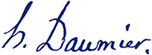
Signature et monogramme
Outre les signatures des différents participants désignés par les termes latins dans la lettre, on trouve couramment, dans le motif, la signature de l’artiste lui-même ou son monogramme composé généralement de ses initiales.Daumier a utilisé plusieurs signatures et monogrammes (le plus souvent «h. D»). Il a aussi utilisé le pseudonyme «Rogelin», pour une caricature de Louis-Philippe, en forme de poire, en 1832
La diffusion des estampes
Censure
Rétablie par un décret de Napoléon en 1810, la censure sera supprimée (1819, 1824, 1828, 1830, 1848) et rétablie (1820, 1827, 1830, 9 septembre 1833, 1852) alternativement durant le XIXe siècle, jusqu’à son abolition, en 1881, par la loi qui établit la liberté complète de la presse. Avant publication donc, une épreuve d’essai avec la lettre était présentée à la censure qui donnait sa réponse dans la journée. Si l’approbation était donnée, par la seule mention « oui », l’imprimeur reportait à la main l’autorisation et enregistrait la pièce. Le tirage pouvait alors commencer pour publication.
Dépôt légal
En vertu de la loi sur le dépôt légal, un ou plusieurs exemplaires de tout imprimé mis publiquement en vente ou en distribution doit être déposé à la Bibliothèque nationale. Cette disposition s’applique à l’estampe depuis 1632. Les pièces déposées sont donc enregistrées à la date du dépôt et conservées au Cabinet des estampes, devenu depuis département des Estampes et de la Photographie, de manière inaliénable comme l’atteste l’estampille apposée sur chaque pièce.
Catalogue raisonné
Liste complète des œuvres d’un artiste, décrites précisément, numérotées. Ces catalogues servent de référence pour l’étude de l’œuvre. Une première esquisse de catalogue raisonné des œuvres de Daumier est réalisée par Arsène Alexandre dès 1888. D’autres viennent ensuite pour l’œuvre lithographique : par Champfleury en 1878, puis Loys Delteil en 1906 avec des rééditions en 1926 et 1969, enfin par Dieter et Lilian Noack sur un support électronique en 2004. Le catalogue raisonné des gravures sur bois a été établi par Eugène Bouvy en 1933 ; le catalogue des dessins et peintures par Karl Eric Maison.
Inventaire
Catalogue descriptif des œuvres d’un artiste au sein d’une collection. L’œuvre de Daumier est décrit, en particulier, dans l’Inventaire du fonds français après 1800, t. V, rédigé par Jean Adhémar, conservateur au Cabinet des estampes de la Bibliothèque nationale, en 1949.
Harris Schrank, a Daumier collector from New York and frequent user of the Daumier Register has written an excellent “users guide” about our internet catalogue raisonné intended to make life easier for fellow collectors. We are copying it here below without adding anything. The guide speaks for itself and we can only hope that this attractive “manual” will catch the attention of many collectors. Congratulations on an exceptional work!
Daumier Print Connoisseurship – A Guide to a New Guide
The prints of Honoré Daumier have long been admired and sought after by art lovers. His lithographs of 19th Century French political and social life are wonderful examples of great draftsmanship, and they’re funny, fascinating and instructive as well. Print collectors are often surprised to learn that many of Daumier’s 4000 or so original lithographs can be bought at relatively modest prices, perhaps a few hundred dollars or less, although some of the more sought-after images can cost thousands. But as in all areas of fine print collecting, it’s essential – and fun – to learn about the prints before investing in them. Now a new facility is available to help Daumier lovers become Daumier connoisseurs: The Daumier Register
The Daumier Register is the result of years of study and scholarship undertaken by Lilian and Dieter Noack. The Noacks have created a massive catalogue of the Daumier lithographs – called the Daumier Register – which is available free, online (just hit Daumier Register on your search engine). You need only register with your email address and a code to have access to this valuable catalogue raisonné.
How the Daumier Register Works
To demonstrate how the Register can help you find out about a particular Daumier print, let’s take just one example. Here’s the print:

There are many ways to find it in the Register. Perhaps the easiest is simply to search for the series, which in this case is Les Saltimbanques, shown at the top of the lithograph. Under this series the Register shows us the picture of three lithographs (there were three in this series), and we can immediately turn to the picture of our print. We see that the Daumier Register (DR) number for this print is 620. Now let’s look at some of the categories of information we’re given for this (and every) print.
Technical Details
The technical details are straightforward – we see the size of the image (8.9 x 10.31 inches), and that it’s a lithograph. If the size of the print you’re considering, or have, is different from this size, your print may not be an original.
Publication Details
Here we see that the print was published in the journal Caricature (and the dates are shown), and also in the journal Charivari. In the main body of the website these journals are described at length.
State Details
This section describes the various states (changes made in the lithographic stone where at least one impression was printed) there are for this print. Before the DR it was thought that there were 4 states, but the Noacks discovered a fifth (where a new address was added in the letters section). The first state is described as very rare – it’s before any letters. Our impression pictured corresponds to the DR state two (of 5); it has letters below the image, but it’s before an address at the lower right. In this state it was published in Charivari, and also some sur blanc impressions were made (with no newsprint on the reverse); ours is a sur blanc impression. As explained in the DR website, the sur blanc impressions were made in limited numbers, for collectors.
Collections Details
This shows the collections which the Noacks have reviewed which have this print. In this case about two dozen institutions, and some private collectors are named! In each case the state of the print, the type of paper used, and in some cases even the provenance of each impression is given. For example, two impressions were found in the Museum of Fine Arts in Boston, one in the second state on wove paper (probably resembling ours), and another in the third state on newsprint (with newspaper print on the back of the print); and the provenance of each is the Babcock collection.
Background
Here’s where the DR is astonishing – it gives background details on each print, enabling the viewer to appreciate what’s going on. In this case each of the characters in the puppet show is identified – the writer Victor Hugo, the musician Berlioz, and three others; and their relationship to Daumier is discussed (e.g., Daumier had a strained relationship with Hugo, etc.). Even the hats of the characters are named and discussed, so the viewer can get a better sense of what Daumier was portraying.
Translation
Here the DR does us another great favor, by translating the text at the bottom of the lithograph. This is not as easy as it appears, for 19th Century French had lots of idioms and special references unfamiliar to us today. In the case of our print, the translation is: Here you see the great celebrities of literary, musical, and artistic France. They are 36 feet tall – measured below sea level.
Conclusion
I’ve mentioned the importance of the catalogue raisonné in some of my other guides on fine print collecting – a good catalogue can be an extraordinary aid in assessing the authenticity, state, rarity, and aesthetic and social context of a print. In the case of Daumier, we now have in the Daumier Register an invaluable tool to help the collector understand Daumier lithographs. And in addition to the information given on each print, the Register also references the extensive Daumier website which explains in depth various aspects of Daumier’s life, the political and social context of France, how Daumier prints were made, published and marketed, and how to make sure a Daumier lithograph is indeed authentic. The DR and its complementary website are a great step forward in Daumier scholarship, and all Daumier enthusiasts – including prospective Daumier collectors – can thank the Noacks for their splendid efforts.
Thank you Harris for this great help!